Behind the images
Read Below
First photo (unedited)
This was what my first batch of photos looked like when I begun this shoot. I shot with natural light in a room that got a lot of sun throughout the day. While I thought this photo showcased the product in a professional way, I knew I had to change something. This photo simply wasn’t eye catching. The simple colors of the product were nice- and well- simplistic. It was a beautiful product, but I needed to capture this beauty in a way that could transfer to the screen. This is when I started to brainstorm.
going wider
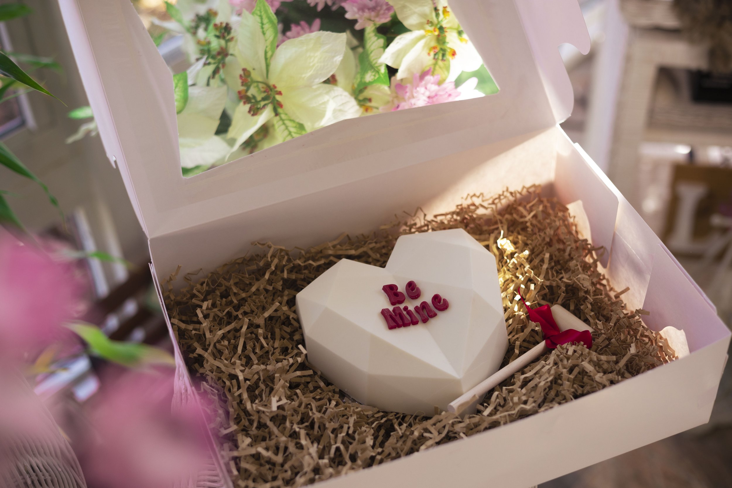
My first instinct was to take a step back to see more of my surroundings. While this was nowhere near my winning photo, it helped me to see the potential this shoot had to be eye catching. The clear top of the box gave a beautiful see through effect, where we could now get a glimpse into the plants that surrounded the room I was in. This is what gave me the idea: flowers.
the flower effect
I took a vase of purple flowers I was recently gifted and placed them among the fake flowers behind the clear box. This added that pop of color that the image so desperately needed. It’s important when doing commercial photography that you don’t mess with the product itself. There were thoughts I had such as: what if I placed some flowers inside the box? What if I stuck some fake butterflies I still have from my last shoot onto the box? No! While that would be a beautiful photo, you cannot give the illusion that this product may come with those decorations included. This is why I only included the props in the background.
Giving dimension
Flowers in the background meant blurry-bokeh flowers too! I held some flowers and ensured they were out of focus, this gave me an added layer of color (and dimension) to my images which I loved. The natural light leaks from the sun gives more of that beautiful dimension.
Time to edit
I chose my top favorite images and enhanced the colors through photoshop. I warmed them up and made the pinks more pink and the greens more green. I also softened the light leaks as some of them were a little too bright for my liking. And voila! The final image. I’m pretty happy with what I ended up with, and I think it’s super interesting to look at the first photos compared to the last. This is a reminder that while commercial photography is meant to be professional, clean, and top quality, it can still be fun and creative too!


